Typography
A well-defined typographic structure enhances the user experience by creating a clear visual hierarchy and guiding users through content seamlessly.
The heading and text scale is responsive, adjusting size based on screen width while remaining accessible. Wider screens use larger type sizes, while narrower screens use smaller settings.
The styles are composed from the primitive type scales, with the addition of primitive font tokens for weight and decoration.
Responsive behaviour
Headings are used for structuring content and guiding users through information.
Heading scale
Heading xl
Used only once within a page, for example a main page heading.
| Screen | Value | Sample |
|---|---|---|
screen/xs | type-scale/heading/bold/700 | Heading |
screen/md | type-scale/heading/bold/800 | Heading |
screen/xl | type-scale/heading/bold/900 | Heading |
Heading lg
Used for major sections within a page.
| Screen | Value | Sample |
|---|---|---|
screen/xs | type-scale/heading/bold/500 | Heading |
screen/md | type-scale/heading/bold/600 | Heading |
screen/xl | type-scale/heading/bold/700 | Heading |
Heading md
For section headings.
| Screen | Value | Sample |
|---|---|---|
screen/xs | type-scale/heading/bold/300 | Heading |
screen/md | type-scale/heading/bold/400 | Heading |
screen/xl | type-scale/heading/bold/500 | Heading |
Heading sm
Used for subsections within a section of content.
| Screen | Value | Sample |
|---|---|---|
screen/xs | type-scale/heading/bold/300 | Heading |
screen/md | type-scale/heading/bold/300 | Heading |
screen/xl | type-scale/heading/bold/400 | Heading |
Heading xs
For lower importance, and to be paired with body text of the same size.
| Screen | Value | Sample |
|---|---|---|
screen/xs | type-scale/heading/bold/200 | Heading |
screen/md | type-scale/heading/bold/200 | Heading |
screen/xl | type-scale/heading/bold/200 | Heading |
Heading 2xs
For lower importance, and to be paired with body text of the same size.
| Screen | Value | Sample |
|---|---|---|
screen/xs | type-scale/heading/bold/100 | Heading |
screen/md | type-scale/heading/bold/100 | Heading |
screen/xl | type-scale/heading/bold/100 | Heading |
Text scale
Text lg
To be used sparingly, when only a couple of words are needed at a large size.
| Screen | Value | Sample |
|---|---|---|
screen/xs | type-scale/text/400 | Text |
screen/md | type-scale/text/400 | Text |
screen/xl | type-scale/text/400 | Text |
Text md
To be used as the base size for all body copy, when the larger of the two default sizes is needed. (No responsive size change)
| Screen | Value | Sample |
|---|---|---|
screen/xs | type-scale/text/300 | Text |
screen/md | type-scale/text/300 | Text |
screen/xl | type-scale/text/300 | Text |
Text sm
To be used as the base size for all body copy, when the smaller of the two default sizes is needed. (No responsive size change)
| Screen | Value | Sample |
|---|---|---|
screen/xs | type-scale/text/200 | Text |
screen/md | type-scale/text/200 | Text |
screen/xl | type-scale/text/200 | Text |
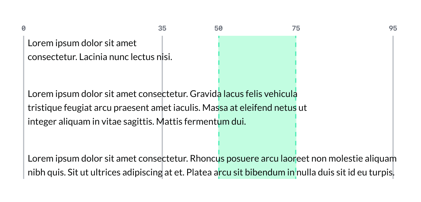
Line length
Line length is between 50 and 75 characters including spaces, to ensure readability and prevent eye strain. Lines shorter than 50 characters create a choppy reading experience, while lines longer than 75 characters make it difficult to move from the end of one line to the beginning of the next.
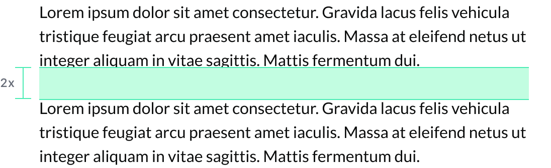
Paragraph spacing
To ensure adequate separation between text blocks and facilitate improved readability, margins should be used for headings and paragraphs. For example, headings can use a top margin of 0.5em and a bottom margin of 1em, while paragraph text can have a top margin of zero and a bottom margin of 2em.
Colour
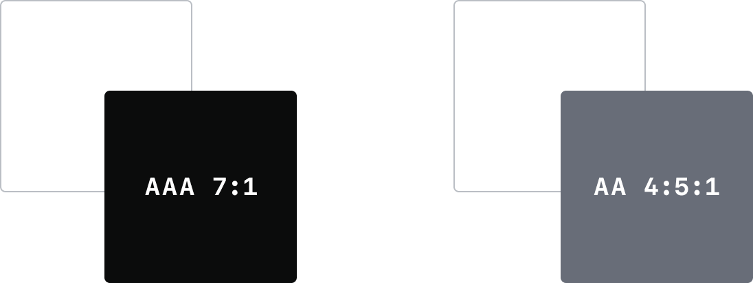
The primary text colour color/gray/950, is the main colour used for all main content, including headings and paragraphs throughout the system.
The secondary text colour, color/gray/600, is used sparingly to complement the primary text colour. It is applied to secondary elements such as captions, metadata, or less prominent text to create a visual hierarchy and enhance the overall design.
Both primary and secondary text colours meet AAA contrast compliance standards when used on a white background, ensuring all text is accessible and readable.